Friday, 30 November 2012
the new website
After talking we have had a massive change around and re-designed all the pages in a different style. We were having problems with it being too blocky, so we got rid of all the seperate blocks and changed the back ground to a picture of Emma, i think this will look much better because it feels less structured and serious and should hopefully fit more with her character.
here's the home page which has lots of things on the side that you can click on and it will take you too a link.
This is a page written as if Emma did it about herself and how she got to where she is.
I really like this fashion page, we added a load of pictures that were taken on our filming day and we also added some other ones of Emma from a small Burlesque shoot.
There is a tour page which also has a write up from each performance as if she was writing it, we did this because it gives it much more of a personal feeling and because she is only just starting up its more likely she would be writting it.
I really like this fashion page which has normal photos of Emma doing normal kinds of things like going ut with friends, with her boyfriend, and a photo of her with 'fans'. i also added the last photo just resently which is a photo of her in and Advertisment which i made on photoshop.
This is the improved merchandies page, the first stuff i did was very quick and not quite professional enough. For her merch we thought it would be could if she had designed her own stuff, so i got some actually nice clothes that i thoght fitted with her style.
This final page took a lot of work which we only just did. i have already talked about the making the perfum on photoshop, and so as a way to involve it we thought up a little competition to do to make it more interesting and really get her fans involved.
Monday, 26 November 2012
editing the website
for the home page of our website we have a bit with Emma's name and then a picture of her from the beach scene, but this doesnt' look quite right as it is all too blocky. To try and help this i fiddled around with the colour of the block to try and make it the same as in the picture. But wix is quite confusing and i couldn't quite work out how to change it so i searched on google for some help.
And found this help video:
This is fiddling with different colours trying to get is as close as i can but it was very hard to get it exactly the same. i then had an idea to change it instead of having a block colour there, i need to try anc cut a photo that size and have it across the top.
And found this help video:
This is fiddling with different colours trying to get is as close as i can but it was very hard to get it exactly the same. i then had an idea to change it instead of having a block colour there, i need to try anc cut a photo that size and have it across the top.
perfume
Sarah and I were talking about our merchandise as we think it needs to be more glamorous, so we were thinking about what other kinds of merchandise stars have and a lot of girl celebrities have their own perfume. It's a good way to target girl fans as they will want their idols smell.
So i began on google and i wasnt exactly sure what shap of bottle i wanted but i thought we should just chose a simple shape that was unknown and girly. I started looking at other celebrities perfumes as just a bit of insparation. It wasn't hard to find some bottles as there is such a massive variety of choice:
Saturday, 24 November 2012
feedback
In friday's lesson we asked a couple of A2 students and an AS student to come in and take a look at our draft versions of our products. this is a really helpful tool to find out how other people see and interperate what we have done. It also worked well for us as they were teenage girls which is our target audience, so what they say could be very influenctial on the changes we need to make.
the first thing one of the girls says about the Digipak was that it reminded them of Lily Allen which we were really pleased as she was one of the main artist we had studied in a research.
Firstly they felt that Emma’s name wasn’t clear enough, the front Mina had chosen was a bit too swirly and small, so had to read, but they did like the girly swirly style of the font. On the front they also thought we should have the album name bigger than Emma’s, I understand this and think it’s a good idea, because we have a big photo of Emma on the front its obvious who the artist is. They seemed to get a good feel for the digipak as when we asked about what genre of music she was without showing them the video or the song they guess a fun, indie/pop style which is the sort of genre we are working in.
Next we showed them the website, it was more clear to me that we hadn’t been working together enough on the digipak and website because they all agreed that they thought the digipak was for a different artist, which I think we could all see too. As a main picture on the front of the website we had a lot more professional modely photo which showed her in a more serious light which throughout the rest of our products we hadn’t. the website was a lot more blocky and had a more sophisticated look to it where as they thought the digipak was very fun with its colours and swirls. They felt the website would target a slightly older audience, I think that the fact that we had a lot of black and white photos from the filming day linked to this. They thought it could have been a models website so I think we need to re-think some of the modely photos we have put up, the problem with this is that Emma is actually a model in real life so she is naturally photogenic but it makes her always look professional.
Moving on to the video, one of the girls immediate reaction was that it reminded her of the Dior advert and we hadn’t told them how we had been inspired by this, this is good because we did want it to have a similar style and look to it. Out of the two we asked, they thought the video went more with the
digipak
digipak
Wednesday, 21 November 2012
getting on
it really feels like our group is getting on well with our products, i'm confident we will produce good finial pieces.
Layla has been getting on well with the editing, here is a screen recording of what she has done so far:
this isn't quite finished yet but you can really see the potential in it to be a really good promo, i think we could do with all discussing how we think it is looking to make sure we all agree with how it is going.
Mina has been doing some final designs to the digipak as we have been discussing trying to make it link more with the website. she has also been coming up with ideas for other song names and the album name which we have all been throwing ideas around for, Sarah, Mina and I sat down and had a talk about names, we didn't want it to be too lovey dovey but it needed to be sweet. Mina had a packet of Skittles and it inspired us for a possible name as they are little and sweet and their phrase is "skittles, taste the rainbow" which kind of links with our summery girly theme.
Sarah has been working further on the website, looking at ways to change the fonts more because we weren't quite happy with the one we had. this proved to be quite difficult but im sure we will be able to find one we all like that we can use on the digipak as they need to be the same.
Monday, 19 November 2012
tour write ups
As a part of the website there is a tour dates page, and underneath there are paragraphs for write ups about the event so I’m going to do that. Im not completely sure what to write so will do some research first. I tried to look on Arvil Lavigne but her website was blocked from the school internet for some reason.
and then i remembered looking at an up and coming girl singer so i had a little look at her website and it was helpful :
'London
: Wow I can’t believe I got to perform at the Forum! It was the most amazing night, the perfect way to start a really exciting tour. I can’t tell you how incredible it feels to come out on stage and see all my fans! It’s going to be hard to top a Thursday, 15 November 2012
tweeting
this is a screen grab of Emma's twitter. we created this account so that when you go onto the website theres a twitter area and you can see all her tweets and get onto it. so i have started tweeting and will keep it up. i am using my account asking friends to follow her trying to make it look like she has lots of fans.
Creating tour dates
I have been helping Sarah with the website by doing things like researching and making the merchandies. on some of the products i wrote some names for cities for tour dates, but as a part of the website we needed proper ones with dates and actual locations so i did a bit of research into this.
Wednesday, 14 November 2012
merchandising
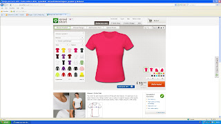
today im going to continue to look into the merchandising for the band. first i typed into google, but i didn't know names of any good personalised clothes making websites so just tried this:
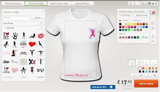
i think these white tops with girly flowery hear type style could work but then i realised there was no indication of Emma so i added her name.
these are some screen grabs from some examples of other students website work.
i think Influx has some nice simple stuff but you can't really tell what the band are like just from those t-shirts, and with ours i want you to imediatly know who it is and what kind of musicain they are.
first i just tried some simle girly tops :
i didnt like the pure pink top, but they may because that isnt my style so i will keep it as an option.i think these white tops with girly flowery hear type style could work but then i realised there was no indication of Emma so i added her name.
i thought back to when i went to concerts and would buy merchandise, the t-shirts often had tour dates on the back as a way of remembering the tour. so i made one, but then i did some research to see if any similar artist did this but i couldnt find girl artist with this so maybe it more male artist that do this.
i then found this breast Cancer symbol and thought we can say she was doing some work for the charity and then have it on a top, this would be amazing for her brand image. being link with asuch a big and great charity would make her look really good.
im not sure about this item but i found it in thew women's clothing section.i thought i might as well make one. their a bit different to the normal tour tops being long, people often go to lots of concerts and buy merchandies everytime so sometimes they may get to the point they make feel ' do i really want to buy another top' so this one could fit in there.
these trackies are classic and i think could sell well.their a style thats very comfortable, cool and people always want trackies. i didnt think it would be nice to cover them with girly stuff or photos of Emma so i just subtly put her name horizontally as i thought thats a good way to still involve her but nopt over crowed it.
this is just a standard plain top with a large photo of the singer. I chose this type of photo because it shows her off well, she looks stunning and classically stylish.
these are some screen grabs from some examples of other students website work.
i think Influx has some nice simple stuff but you can't really tell what the band are like just from those t-shirts, and with ours i want you to imediatly know who it is and what kind of musicain they are.
i wasnt very impressed with this American band, yes the logo in the middle is cool but its very common. there are lots of tops out there like them, and the only difference they have made is to have different colour sleaves. they could have atleast put the image onto other products in different places.
i like how the xyz have their logo on the tops, that links it straight to the band and if you are fans you will be able to spot that. but i still think we can make better ones.
i thought making an ipad case is very relevant to modern times because everyone seems to have some kind of tablet. it wouldnt let me put a picture of Emma on so i thought a large girly kiss would have to do.
Subscribe to:
Posts (Atom)